WORK
Explore my portfolio - building the systems that enable experiences that connect, evolve, and endure.
Featured Work
Selected Work
Featured Work
Selected Work
Behind every project here is the system that made it possible. I led the operations, planning and delivery that took brand, product and digital work from first brief to global launch, on time and built to last.
Delta
End-to-end travel ecosystem
Delta wanted its digital ecosystem to deliver the same service its people are known for, across every step of the journey.
I led the end-to-end program management behind it, designing the workflows, communication and governance that enabled multiple teams to build the Fly Delta app, Delta.com and a dozen connected touchpoints in parallel, while providing reporting transparency for both clients and internal leadership.
-
The challenge
Delta Air Lines prides itself on customer service. As the airline grew, they wanted the digital ecosystem to work the same way its best people do: anticipating what travelers need. That meant rethinking not just individual products, but how the whole journey, and the teams building it, fit together.How we delivered it
I led the program end to end, guiding a talented, multidisciplinary team through a series of industry-first experiences and services, including Live Baggage Tracking and Automatic Check-In. Together they accompany travelers from the first moment of inspiration through to their arrival home. The Fly Delta app sat at the center of an ecosystem that also spanned the new Delta.com, gate displays, in-flight entertainment and Wi-Fi portals, kiosks, wearables and AI systems. I designed the program structure and workflows that enabled workstreams to run in parallel without drifting apart: shared planning and dependency tracking, clear decision paths, and a regular communication cadence that gave Delta's stakeholders and our teams full transparency into progress, risks and tradeoffs. As the work evolved, I kept refining those workflows, removing handoff friction so teams could spend more of their time building.The impact
By reimagining the travel journey as one connected ecosystem, the program helped reshape what Delta means to frequent travelers. Fly Delta was voted the best global airline app, Fast Company named Delta one of the world's most innovative companies, and the app has now been downloaded more than 38 million times.
My role
Director, Program Management & Creative Ops
Core Disciplines

My role
Program Management & Creative Ops
Core Disciplines
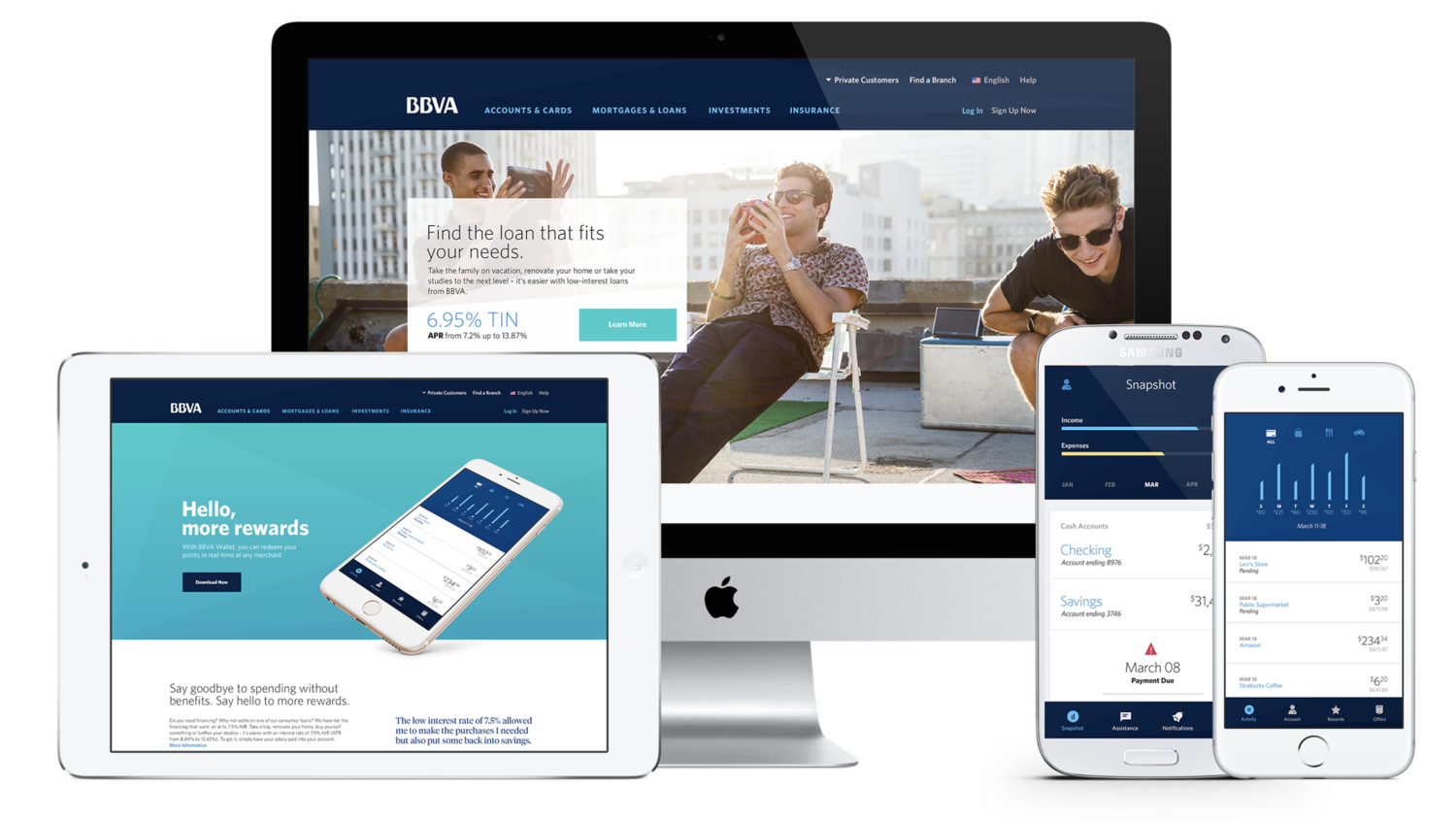
BBVA
Unifying a global brand that speaks many languages
BBVA's brand had splintered across Spain, South America and the Southern US, just as the bank set out to reinvent itself as a digital-first company.
I led the end-to-end program and creative operations behind one global brand system, building the workflows, review processes and localization framework that let a single identity launch across markets with very different languages, cultures and constraints.
-
The challenge
BBVA, a global financial institution spanning Spain, South America and the Southern US, faced a critical problem: its brand had fragmented market by market, leading to inconsistent customer experiences and diluted brand equity. As the bank embarked on a digital transformation, it needed a cohesive global identity that could connect with very different audiences while signaling its ambition to evolve from a traditional bank into a modern, digital-first brand.How we delivered it
Through a series of global research engagements, my team developed core personas that captured the values and needs BBVA's customers shared across regions. Those insights shaped a flexible visual language, a set of design principles built for digital expression, and design system. Making one system work everywhere was as much an operational challenge as a creative one. I led the program end to end, building the creative operations to match: a shared workflow and review cadence across in-house, agency and regional teams, and a localization framework that separated what had to stay globally consistent from what each market could adapt. Each region brought its own languages, cultural expectations, local constraints and timelines. I planned for those differences from the start which kept regional teams aligned while giving them room to make it their own.The impact
The work helped reposition BBVA from a traditional financial institution to a modern brand focused on lifestyle and innovation. By delivering an ownable, scalable design system that stood apart from competitors, and the operating model to roll it out market by market, we enabled BBVA to break out of the "sea of sameness" with a cohesive, human-centered experience that reflects its bold, future-focused vision.
My role
Director of Innovation & Portfolio Mgmt
Core Disciplines
P&G
MVP Learn & Accelerate
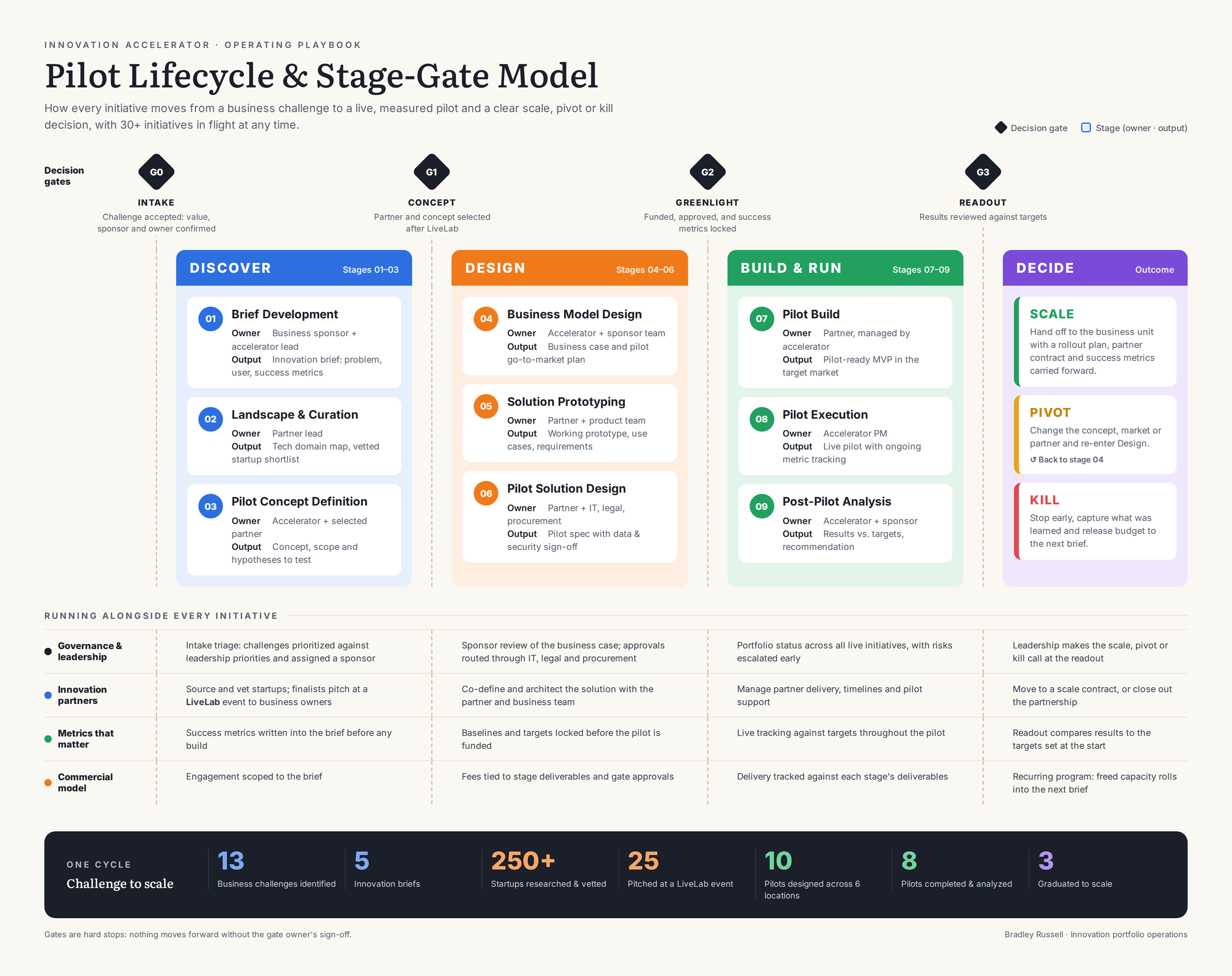
I built and ran P&G's Signal Accelerator, an internal innovation engine with 30+ parallel initiatives; taking ideas from business challenges to live pilots with a clear scale, pivot or kill call.
I built the operating model and stage-gate framework, ran the startup partner pipeline from sourcing to live pitch events to solution design, and reshaped Pilot44's revenue model so the program was sustainable for both sides.
-
The Challenge
P&G wanted to move at startup speed inside a 180-year-old company. Business units (Oral Care, Hair care, etc) had real problems worth solving, such as consumer engagement, personalization and manufacturing quality. Emerging tech like AI, computer vision and conversational interfaces were moving faster than any corporate procurement or R&D cycle could follow. Ideas came in from everywhere, there was no standard way to determine which ones deserved investment, which startups could be trusted inside a Fortune 500 environment, or when to stop funding something that wasn't working. Without that structure, innovation tends to end up as one-off experiments that never scale, or as pilots that drag on because nobody has the authority or the data to end them.
Pilot44's job was to change that. We embedded inside the organization, built an accelerator around P&G's own business priorities, and proved out MVPs quickly and cheaply before anything was rolled out to the broader enterprise.
How We Delivered It
1. A P&G-specific stage-gate framework and operating model
I adapted Pilot44's innovation lifecycle into an operating model built for how P&G actually makes decisions. Every initiative moved through defined gates:
Solution brief
Landscape analysis and partner curation
Pilot concept definition
Business model design
Prototyping
Pilot build and execution
Post-pilot analysis
A formal kill, pivot or scale recommendation
Business challenges from brand and functional teams were captured, scoped into structured innovation briefs, and prioritized against leadership input before any money or partner time was committed. At each gate, leadership weighed in on whether an initiative kept going. Those calls rested on a defined set of performance metrics set before launch. Technology partner selection, legal and procurement approvals, and hand-off were built into the flow, so a successful pilot wouldn’t stall. With 30+ initiatives in flight at once, this model gave everyone, from brand leads to executives, a shared view of what was running, how it was performing, and what decision was coming next.
2. Owning the innovation partner ecosystem
I managed the innovation partners for every initiative across the accelerator. For each challenge, we mapped the technology landscape, researched and vetted startups and vendors, and curated a shortlist that could meet P&G's bar for capability, security and readiness. In one round alone, 250+ startups were researched and vetted against 13 business challenges and 5 innovation briefs. Twenty-five of them were selected to pitch live at a LiveLab event.
I designed and ran these LiveLab events: live pitch sessions where shortlisted startups presented directly to P&G business owners and leadership; compressing months of vendor evaluation into a single day of decision making. Once partners were chosen, I worked side by side with the startup and the P&G team to define the use case, set requirements and architect the pilot solution.
3. Optimizing the revenue model
Alongside the program, I reworked how Pilot44 packaged and priced the engagement. The goal was to be a fair, trusted partner to P&G while building recurring revenue. I aligned the commercial model with the stage-gate lifecycle, so the value P&G paid for, tracked against defined deliverables and decision points. That made the accelerator a repeatable, ongoing program with the model giving P&G predictability and clear ROI at each gate, and Pilot44 a sustainable, scalable way to deliver across more clients.
Holcim
Building the future
When Holcim created Amrize to unite its North American businesses under one brand, I led the account and delivered its flagship digital platform in record time: 40+ custom components and 300 pages, designed, written, localized and tested.
I ran the work on AKQA's operating framework, which I refined and optimized, with clear stage gates, a tightly integrated design-to-development workflow and custom AI tooling. It launched a brand-new identity that exceeds industry benchmarks for speed, accessibility, SEO and usability.
-
The Challenge
Holcim, a global leader in sustainable building materials, created Amrize to bring its North American business units together under a single brand. These businesses had operated under different names, sites and identities, in a fragmented market where customers, investors, contractors and communities each needed something different. To launch the brand credibly, Amrize needed a cohesive digital platform and identity that matched its scale and its ambitions. It also needed it on a launch date that couldn't move.
What We Launched
We launched Amrize publicly with an immersive online experience. The site combines compelling storytelling, thoughtful design and technical precision to build trust, support growth and speak to every audience, from customers and partners to investors and future talent.
How We Delivered It
1. A refined operating framework with clear stage gates
I ran the program on the AKQA operating framework I had been refining across engagements, adjusted for the speed and scale this launch needed. Every workstream (strategy, content, design, development, localization and QA) moved through clear stage gates. Each gate had defined entry criteria, owners and sign-offs, so decisions happened at the right time and with the right people, and nothing went downstream half-finished. Because the gates were clear, we could run workstreams in parallel which was a big part of how we hit the timeline without cutting corners on quality.
2. A design system built for global collaboration
I optimized the design system process so components were defined once, documented clearly and reused everywhere. We used Figma's Dev Mode to give developers direct access to specs, tokens and component behavior. That removed most of the back-and-forth between designers and engineers, and kept teams in different regions working from the same source of truth with no misreads of design intent. The result was 40+ custom components that looked and behaved consistently across all 300 pages.
3. An AI-powered content engine
The biggest bottleneck in the launch was content. We had 250+ pages of new copy to write, review, localize and implement. To make that work at speed, I built custom AI tooling that turned content production into a tracked, repeatable pipeline:
Content-to-component mapping: each piece of copy was mapped to the component it would live in, so writers wrote to fit and developers built without guessing.
Metadata mapping: metadata was linked to images, copy and components, which kept SEO, accessibility and asset management consistent.
Automated tracking and reporting: progress on content authoring was tracked and reported automatically, so status was always visible without manual check-ins.
Localization built in: the copy docs were customized to support localization directly, and those variants carried through to implementation and testing.
Automated smoke and regression testing with a human in the loop: automated tests ran on every release and a reviewer confirmed the results. Issues surfaced early and the team kept final judgment.
4. AI-driven leadership reporting
I also built an AI-driven dashboard and reporting tool that gave leadership a real-time view of program health: progress against milestones, content status, risks and quality. Reporting that used to take hours of manual assembly now ran continuously.
The Impact
Amrize launched on time with a platform that exceeds industry benchmarks for speed, accessibility, SEO and usability. Built to scale with the business, the platform is now a strategic tool for Amrize's growth and expansion. The tooling and processes behind it carried forward into AKQA's operating model for future engagements.
Brushly
Habitualize healthy habits through gamification
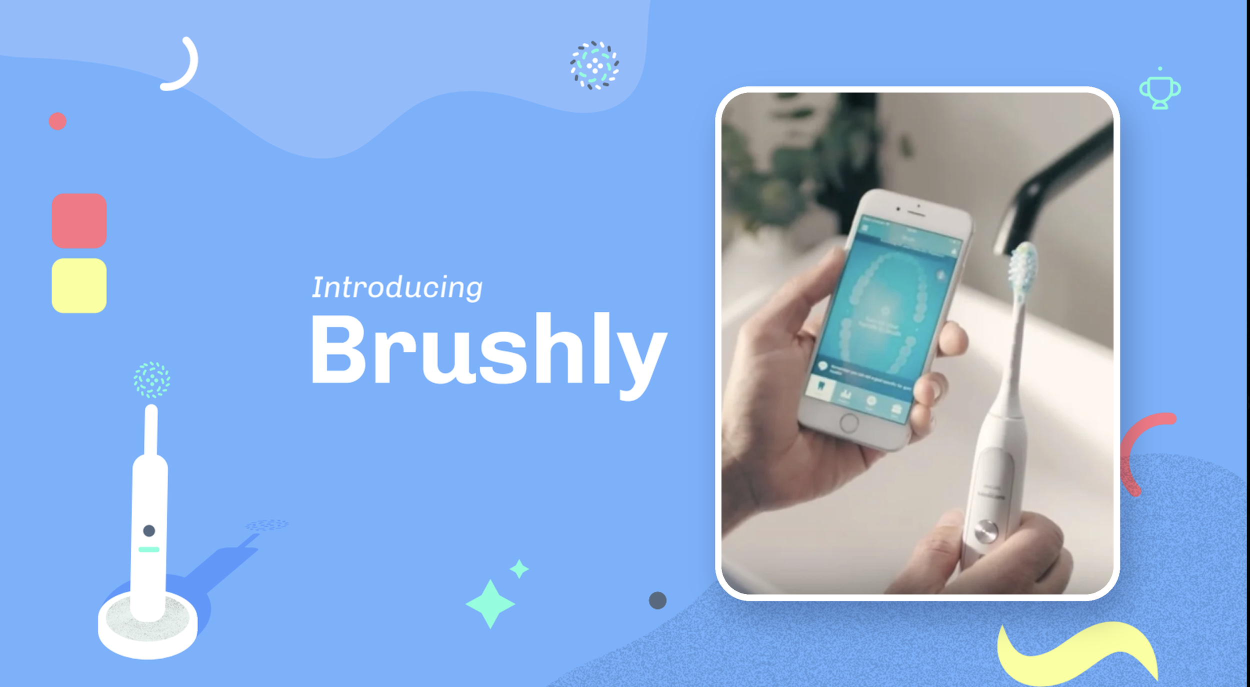
Out of P&G's Signal Accelerator, I helped launch a venture that linked Oral-B's connected toothbrush to Cigna dental insurance, rewarding people for healthy brushing habits through a gamified app.
Within six months, 70% of users hit the two-minute brushing goal (up from 47%), they bought Oral-B products at twice the typical rate, and Cigna saw an 8% drop in dental claims costs. Both companies have since scaled the program.
-
The Challenge
P&G wanted to grow incremental revenue from Oral-B's connected power toothbrush. Meanwhile, insurers like Cigna spend heavily on dental claims that better daily habits could prevent. Both companies had something to gain, but there was no model connecting what happens at the bathroom sink to outcomes that P&G, an insurer and a consumer would all care about.
The question was whether connected consumer tech could actually change behavior, and whether that change could be measured well enough to create shared value across a consumer goods company and a health insurer.
What We Launched
My team partnered with Cigna to launch an IoT-enabled dental insurance program that rewarded healthy brushing. By linking daily brushing data to insurance incentives, we turned oral hygiene into a gamified wellness journey that made dental care engaging and measurable. Through a custom app, users got real-time feedback on how they brushed and earned rewards for consistent, healthy habits.
How We Delivered It
1. From accelerator initiative to standalone venture
The program started inside P&G's Signal Accelerator and went through the same stage-gate process as every other initiative. We defined the business challenge, set success metrics up front, designed and ran the pilot, and brought results to leadership at each gate. Because the pilot hit its targets on brushing behavior, product purchases and claims costs, it got a clear "scale" decision and was spun out as its own venture instead of ending as a one-off experiment.
2. Building a three-sided partnership
This only worked if it worked for everyone: P&G needed incremental revenue and engagement, Cigna needed lower claims costs, and users needed a reason to care. I worked with P&G and Cigna to define the program and design a business model in which each party's incentive reinforced the others'. Better brushing earned users rewards, rewards drove more engagement with the brush and more product purchases, and healthier habits lowered claims costs. Getting two large organizations with very different priorities, approval processes and risk tolerances aligned on one program was as much a part of delivery as the product itself.
3. Designing for behavior change
The experience was built around habit formation rather than features. The app gave immediate, easy-to-read feedback on each brushing session, and gamification (goals, streaks and rewards for consistency) made a two-minute routine feel worth doing. Linking those habits to real insurance incentives gave users a tangible reason to keep going after the novelty of a new device wore off.
4. Measuring what matters
We tracked the outcomes each partner cared about from day one: brushing duration and consistency for users, product purchase behavior for P&G, and claims costs for Cigna. Because those measures were agreed and baselined before launch, the results were credible to both companies and made a strong case for scaling.
The Impact
In just six months:
70% of users hit the two-minute brushing goal, up from 47%.
Users bought Oral-B products at twice the typical rate.
Cigna reported an 8% drop in dental claims costs.
The program showed that connected consumer tech can change real behavior and create measurable value across the health and insurance ecosystem. It was one of the Signal Accelerator's clearest wins, and both Cigna and P&G have since scaled it, helping bring Oral-B's connected toothbrush experience across P&G's broader partner network.
My role
Director of Innovation & Portfolio Mgmt
Core Disciplines
My role
Director, Program Management & Creative Ops
Core Disciplines

Culligan
Modernizing the brand for a younger generation
Culligan's 70 years of acquisitions had made it strong but fragmented, I was tasked with leading the program that rebuilt the brand from the ground up and then brought it to market.
That covered the brand strategy, a go-to-market playbook, national commercials, a new corporate site and a new culligan.com eCommerce experience. I ran the full program end to end and optimized the workflows so each phase built on the last, turning one brand vision into a connected system that continues to drive Culligan's growth today.
-
The Challenge
Culligan, a leader in drinking water and water treatment systems, was at a crossroads. Over 70 years, growth through mergers and acquisitions had made the business strong, with more products, more markets and more expertise. It had also added a lot of complexity: separate businesses, inconsistent brand expressions and a customer experience that changed depending on where and how you met Culligan.
Leadership knew the only way to become a truly world-class business was through compelling products, quality service and a cohesive brand experience. That meant one brand strong enough to unify a global portfolio.
How We Delivered It
1. Building the brand strategy
I led an experienced brand team to build a strategy that could carry Culligan into the future, around four pillars:
Uniting the global portfolio under one clear, coherent brand.
Commanding the marketplace with a distinct, confident position in a category most people don't think about.
Increasing relevance and resonance so Culligan matters to consumers in their everyday lives.
Deepening internal connection so employees and acquired businesses rallied behind a shared identity.
That work led to a new vision for the company: anyone can get the water they love, anywhere on Earth. It gave every team and every business unit one north star to build from.
2. Scaling from brand into execution
With the brand in place, I grew and led the teams that took it to market. The scope expanded across four connected workstreams:
A robust go-to-market strategy and marketing playbook that turned the brand into practical guidance for every market and business unit.
A series of commercials and production shoots that introduced the new Culligan to consumers.
A new corporate site to tell the company story to investors, partners and future employees.
A new eCommerce platform at culligan.com, which made it simple for customers to find, buy and service the right water solution.
3. Running it as one program
I managed the entire program from brand strategy through to launch. Instead of treating each deliverable as a separate project, I structured the work as phases on one integrated roadmap. Each phase handed clear, approved outputs to the next, so brand decisions flowed directly into the playbook, the creative, the corporate site and the commerce experience. I optimized our workflows so teams worked in parallel from a shared source of truth, set up governance that brought stakeholders from across Culligan's businesses into the right decisions at the right time, and kept a growing, multi-disciplinary team aligned as the scope expanded.
The Impact
Culligan came out of the program with one brand, one vision and a connected ecosystem of brand, content, corporate and commerce experiences, instead of a patchwork of acquired identities. The new brand gave the company a clear position in a low-awareness category, a shared identity for employees across the business, and a digital foundation built to sell and to scale. Culligan's growth continues today, building on the platform we created.
Verily
One Verily, One System
Verily started inside Google X as a set of bold, separate experiments. When it unified under One Verily, its story was spread across too many products for anyone to follow. I led the AKQA program that gave the new vision a home: a refreshed design system and a digital platform built to explain One Verily to patients, insurers and clinicians.
The design system was the backbone of the work. I set up the process that kept design and engineering on one source of truth, with tokens built alongside developers, synced from Figma to GitHub and turned directly into code.
-
The Challenge
Verily is a medical technology company working on precision health, closing the gap between research and care. Founded in 2015 out of Google X’s Life Sciences group, it began as an experimental startup running many small, ambitious projects. That produced real innovation, but it also left patients and customers with a fractured story. Verily responded with One Verily, a single, connected portfolio of solutions.
To bring that vision to market, Verily partnered with AKQA on a refreshed design system and digital platform. The system had to work on any platform and across multiple brands, be easy to use and maintain, and stay in sync with code.
My Role
I led the program end to end, from research and experience strategy through design and build. Design systems weren’t new to AKQA, but shaping our operating model around Verily’s needs was. I treated the system as a process, not just a deliverable: it set how design and engineering worked together and let the platform keep growing after launch.
Adapting How We Worked
No single methodology fit the whole engagement, so we ran a wagile model. Some components and design work ran fully agile alongside engineering, while others followed a more structured path. Each piece of work received the approach that suited it, which kept things moving quickly without losing control of the foundations.
Foundation First
Creating components is the easy part. The token architecture, sub-systems and foundational styles, along with the working relationships between teams, are what let a design system work and a company scale.
Tokens That Stay in Sync With Code
We built the token architecture with engineering so design and code would never drift apart:
Design: tokens defined in Figma using Tokens Studio.
Sync: pushed directly to GitHub.
Transform: converted into code with Style Dictionary.
Implement: plugged straight into Tailwind CSS.
Matching our global tokens to Tailwind’s naming conventions meant a change made in design reached production without anyone translating it by hand. Tokens also let Verily adapt its visual language to new color modes or entirely new brands for far less effort than building each from scratch.
Components Built to Scale
Atomic design: sizes were handled at the atomic level and nested inside more complex components, instead of building every size of every component.
No hidden base components: we avoided unpublished base components, which make issues harder to troubleshoot and the system clumsier to use.
The Platform
Navigation and wireframes were built around one need: telling the complex One Verily story simply to patients, insurers and medical professionals. The design balanced Verily’s medical expertise with its human impact and set it clearly apart from legacy healthcare companies. A shared component library lets Verily keep expanding consistently.
Beyond Verily
The program’s speed, success and depth of documentation made it a working example inside AKQA. I used it to champion changes to our constantly evolving workflow:
Token architecture as a starting point: global, alias and component tokens built with engineering before any components.
Naming standardization global tokens named to match the dev framework (Tailwind on Verily), so nothing gets translated between design and code.
A Figma-to-code token pipeline: Tokens Studio to GitHub to Style Dictionary as the default way to keep design and code in sync.
Atomic sizing: sizes handled at the atomic level and nested, which keeps component sets and file sizes small.
Published components only: no hidden base components, so libraries are easier to troubleshoot and use.
Built for multiple modes and brands from day one: tokens structured so new color modes or brands are a change of values, not a rebuild.
The Result
A coherent One Verily story, delivered through a platform that stays in sync with code and a design system built to absorb new products, modes and brands. Inside AKQA, it raised the bar for how design systems are built, documented and handed off.
“The strategic thinking, creative vision and commitment to the partnership AKQA brought to this project was incredible.”
Ryan Miller, Head of Corporate Marketing, Verily
My role
Director, Creative Ops
Core Disciplines
My role
Director, Creative Ops
Core Disciplines
mParticle
The Joy of Being Known
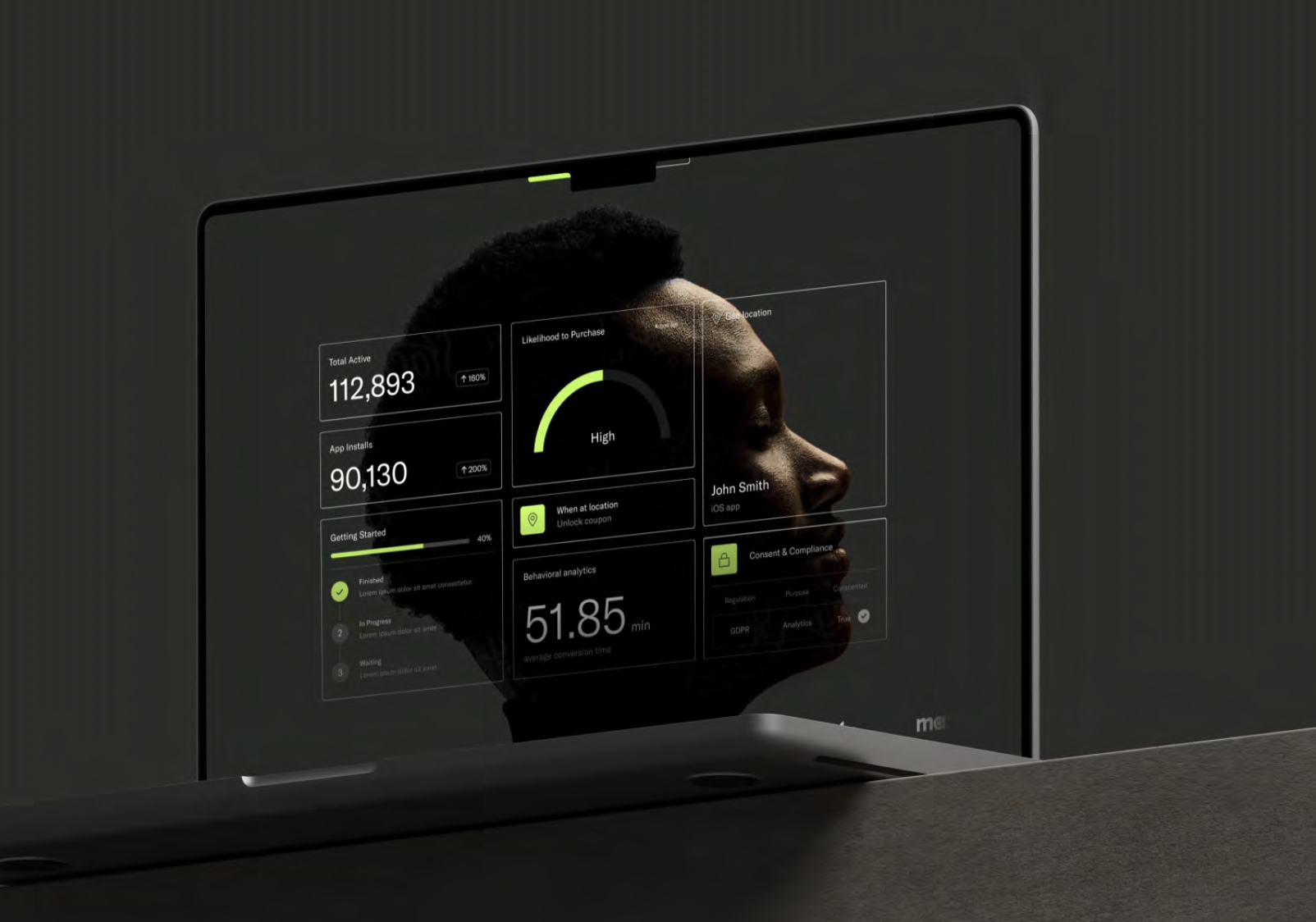
mParticle helped create the customer data platform category, but its deeply human point of view was getting lost among technical competitors that all sounded the same. AKQA was brought in to sharpen the brand strategy and narrative so mParticle could stand out as the thought leader it already was.
I led the account and delivery, taking the work from brand strategy through a new visual identity to the design of mParticle’s next-generation website. I kept the program focused, on budget and on schedule, so each phase built on the strategy before it.
-
The Challenge
mParticle is the original leader in customer data platforms: the back-end systems that collect detailed customer data and personalize digital experiences for each individual. Unlike most behind-the-scenes B2B platforms, its technology puts the customer at the center of every interaction.
That human perspective was getting lost in a crowded, technical category where differentiation was unclear. mParticle partnered with AKQA to refine its brand strategy, spotlight its thought leadership and clarify its narrative, then carry that into a new visual identity and website.
My Role
I led the account and delivery end to end, owning the client relationship, scope, budget and timeline across strategy, identity and web design. The engagement had its own set of challenges, but a clear brief, a realistic budget and timeline, and an engaged client let us keep it focused and running smoothly from start to finish.
The Idea
To humanize a highly technical, AI-powered platform, AKQA distilled the deeper emotional impact of the technology: the joy of being seen and known as an individual. From that foundation, the manifesto, narrative and messaging strategy came together into a visual identity system that breaks from the industry’s technical jargon and its typical bright, graphic platform design.
What We Delivered
Brand strategy: a clear positioning built on the joy of being known.
Narrative: a manifesto, platform narrative and messaging strategy.
Visual identity: a new system that sets mParticle apart from category clichés.
Website: the design of mParticle’s next-generation site.
The Impact
mParticle’s employees rallied around a motivating purpose, and its leadership and product vision gained a clear focal point. The company stepped forward with a stronger identity, a clear platform narrative and a website that speaks to its core audience with an emotional resonance no one else in the category had.
Moxie
Designing a Friend
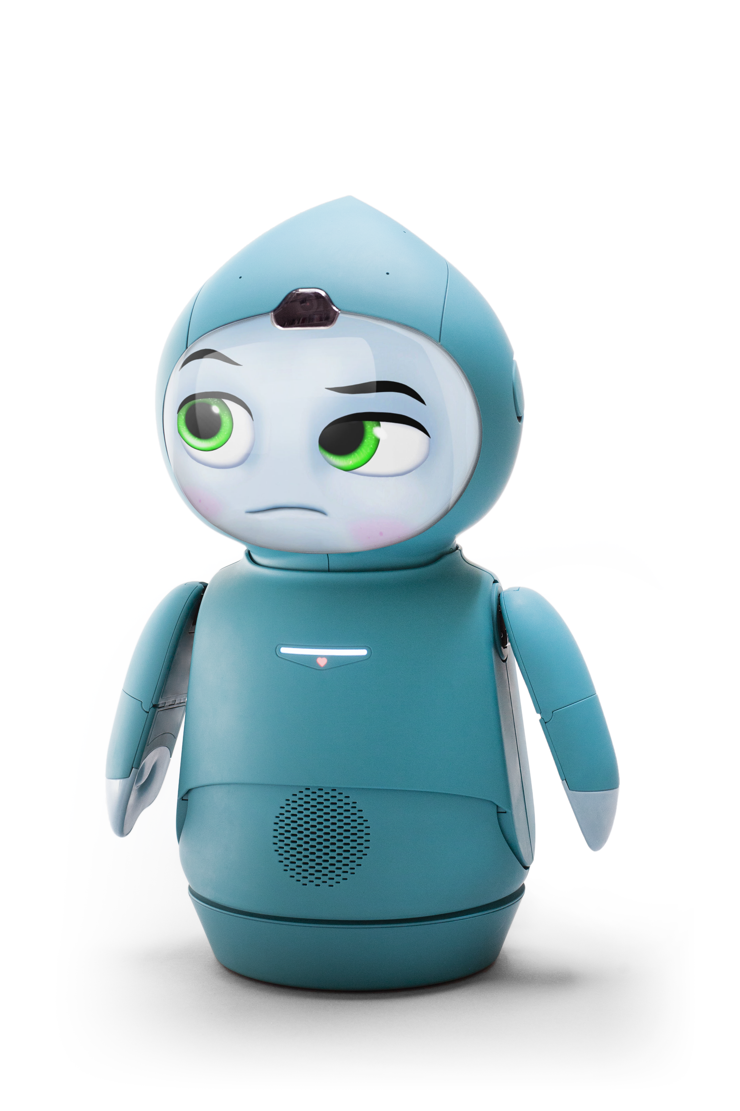
Embodied’s Moxie is an animated companion robot that helps children build social, emotional and cognitive skills. Fuseproject was brought in to turn its AI into something children could instantly relate to: a character with a backstory, a personality and a face kids would trust.
I led the account and delivery. Moxie was also the first project to run on the PMO I’d built for Fuseproject. Resource modeling and scenario planning let us staff the work properly and deliver on tight timelines, saving a significant amount of rework and budget while industrial design, character, UX and engineering moved forward in parallel.
-
The Challenge
Embodied, Inc. created Moxie, an animated smart companion robot that helps families support the social, emotional and cognitive development of children across the ability spectrum. The challenge was to translate the AI into something relatable for children aged 5 to 10, closing the gap between the technology and the child using it.
My Role
I led the account and delivery end to end. Moxie was the first project to run on the PMO I had just put in place across Fuseproject, which made it the proof point for the whole model.
Running the Program
Resource modeling and scenario planning: we modeled staffing against demand and tested scenarios before committing. That let us staff correctly and deliver on tight timelines, avoiding a significant amount of rework and budget.
Parallel workstreams, one plan: industrial design, character and backstory, UX and engineering ran at the same time, coordinated through shared workback schedules and clear dependencies.
Review and approval cadences: regular design reviews and client approvals kept decisions moving and stopped late changes from rippling across the work.
Risk protocols: risks were flagged and prioritized early, so issues surfaced before they could affect the schedule.
Financial visibility: scope, budget and forecast were tracked together, giving leadership and the client a clear view of program health.
Giving the AI a Character
We worked with Embodied to define Moxie’s purpose and character traits so it could engage children aged 5 to 10. Alongside the backstory, the team designed a simple but expressive range of body language and facial features for natural interactions with kids. Particular care went into emotional expressions children could easily recognize, which also helped guard against excessive screen time.
A Look That Tells the Story
Moxie’s backstory is that it’s a visitor from “The Global Robotics Laboratory,” on Earth to learn how to be a good friend to humans. Every feature supports that story: the ears, the head and its playful projection tip, the chest UI badge, the speakers, and the arm, hand and finger details all present Moxie as a friendly robot ambassador.
The AI’s emotional intelligence shaped the overall form, color palette and materials. The team explored many forms so Moxie would feel inviting at first glance. They designed a distinctive head profile and carefully balanced clothing, proportions, hands and silhouette to keep Moxie gender-neutral and true to its backstory.
The Impact
Moxie earned its place as a technologically impressive and emotionally resonant companion, praised by critics and families alike. Reviews highlighted its lifelike interactions and its ability to support social and emotional learning in children, including children with autism.
“The robot pal you dreamed of as a kid.”
Wired Magazine
My role
Client Director & Program Delivery
Core Disciplines
My role
Senior Director, Creative Ops & Program Management
Core Disciplines
